Top 9 Colors that Go with Red


Red is associated with love, passion, and energy, creating a unique appeal in interior design. You can pair it with cool colors for a sharp contrast, metallics for a regal feel, or muted colors for an earthy look.
Warm Neutrals
Warm neutrals work for traditional or modern designs. Pair warm shades like beige, tan, and cream with red to create a cozy vibe.
1. Red with Beige

Designed by Tom Stringer, this living room uses red and beige as its primary color palette. Using a plush beige carpet offers a softer counterpart to the bold walls, and an exotic cowhide rug adds character.
Red and beige give this room an overall traditional feel, but the designer wove many eclectic elements throughout.
2. Red with Cream

In this modern living room, cream adorns the wall while red works as an accent through the sofa and rug. A coffee table in front of the couch takes center stage, holding simple accessories like candles and books.
Earth-tone colors are weaved into the design through the chairs, plants, and artwork, giving this room a relaxing feel.
Bold Contrasts
Bold contrast helps add visual interest and create a focal point, enhancing an interior design’s aesthetic appeal.
3. Red with Black
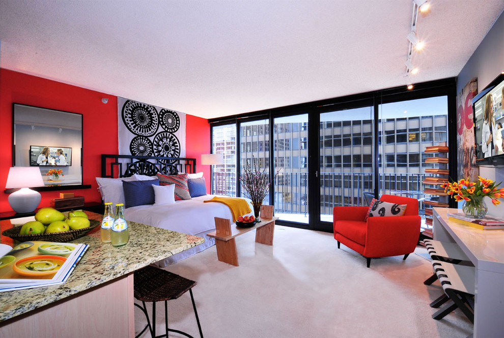
Designed by Mary Cook, this studio apartment features a captivating blend of red and black. A bright red wall adds vibrancy, and wall-to-wall carpet softens the look. The black accents offer bold contrast, giving the space a contemporary style.
Nature-Inspired Hues
Using nature-inspired hues in an interior design mimics the tranquility of the natural world.
4. Red with Forest Green

Fiona Campbell’s interior design captures the essence of nature with hues of red and forest green. The red armchair and Chesterfield ottoman create a charming area to unwind. Soothing, muted forest green paint on the walls creates a calming ambiance.
A medium-sized mirror reflects the sunlight coming in through the nearby window. The collection of books, a fireplace, and delicate lamps add character to the color combination.
5. Red with Gold

Gold represents wealth and prosperity. Pairing red with gold makes this interior design feel luxurious. The dining room chairs have red and gold patterns, tying into the color scheme.
Using gold-plated molding for the ceiling creates a sense of grandeur. The clouded wallpaper adds to an earthy yet regal look.
Cool Accents
Cool accents create a sense of freshness in a space. They offer contrast while contributing to a balanced, harmonious environment.
6. Red with Turquoise

Turquoise is associated with inner peace, calmness, and serenity. Blending red and turquoise creates a sense of vibrancy. The two turquoise armchairs are the room’s focal point, adding energy and a pop of color.
Tie-dye patterns on the cushions and ottoman add visual interest to the seating area.
7. Red with Navy Blue

Navy blue is the color of serenity, stability, and dependability. Since navy blue is a cool color, warm red accents pop against it. Even though red is only a small part of this kitchen, it makes a big impact.
Earth Tones
Earth tones are the colors you can find in nature. Using earth tones in interior design creates a warm, grounded atmosphere.
8. Red with Brown

B Fein Interiors combines red and brown in this traditional-style living room. Brown creates a sense of practicality and steadiness, while red adds energy.
The designer used red in a bold way, putting it on the walls and curtains. Small accents in the pillows, rug, and table decor help tie the brown and red together.
9. Red with Mustard Yellow

Red and mustard yellow are both warm colors that work well together. The dark red walls give the room a bold look, and the earthy mustard yellow adds a sense of calmness. The wood tones also help to give this space nature-inspired vibes.